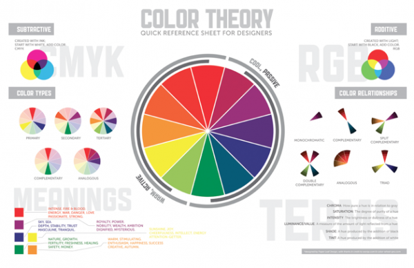
To determine the correct color selection, graphic designer need to do cautiously study.
TYPES OF COLOR – In graphic design you will find three major color models: 1. CMYK 2. RGB 3.Pantone
CMYK – CMYK means (cyan, magenta, yellow, carbon (black)). With mixing of these four colors in theory we can easily create all the other colors.
RGB – RGB signifies red, green, and blue. This sort of colors is applied for what we watch on display of computer monitor or TV.
PANTONE – Pantone colors are widely used in a process of printing where we like to have exact color matching, so when we must have uniformity of colors it is the best to use Pantone colors.For instance, if someone likes to print catalog about his firm he will do it applying CMYK model yet he will use Pantone color ( known as spot color) for his company's logo in order to be sure that logo will appears exactly as he wants to be. Usage of Pantone (spot) colors will escalate expenses of printing but it is vital when we need to accomplish even look of printed material.The only limit of Pantone colors (but it is the same for all other colors) is their dependence of the type of paper or cardboard on which they're going to be printed.
DIRECTIONS WHILE USING COLORS – colors could have different interpretation in different cultures. In China white is the color of death. Softer and stronger colors attracts consumer with modest salaries while clients with highest incomes usually use more delicate colors.
MEANING OF COLORS – When doing design designer should have reason for choosing the color he s going to work with, if not how he will convince the contracting authority that the color he opt for is the right one for his project?Below you will find some of definitions connected with color: Blue: sky,sea,water,trust,wisdom,trust,loyalty,stability,faith,peace
Red: fire,love,energy,passion,power,danger,heat,warning
Green: money,growth,envy,loyalty,fertility,environmentally acceptable
Yellow: energy,sun,creativity,happiness
Orange: sunlight,joy,success,encouragement,autumn
Purple: power,luxury,nobleness,nobility,spirituality
Brown earth,stability,organic,open space
MARKETING POTENTIAL OF COLOR
RED – colors the eye fastest see. Symbolizes vigour, sex, danger, power.
BLUE – bloodless color preferred generally from European people meaning trust and reliability. YELLOW-warm and stimulating like the sun, boosts emotions of happiness, young people love her most. Might be connected with betrayal.
ORANGE – hot, lively shade with out traces of aggression as in red, good to catch the attention of impulsive customers.
GREEN – fresh and cold in common with nature, grow, hope but also with illness and superstition. PURPLE – linked with religion, spirituality and dignity.
PINK – lightly and gently, give security , it is use as a symbol of love.
WHITE – purity, involved with nature and light. In Asia is involved with sorrow and death.
BLACK – sophistication, elegance, mystery, but also it is a symbol of death and occult.
GOLD – noble color, precious
SILVER – prestigious color or sometimes can associate on something technological. In business world uniformity is best practice. Structure always results in certainty and strength. One way that display strength and certainty is great graphic design that shows firms at its finest, and color as an important aspect of that graphic design.
